In an era where a website serves as the digital face of a business, mastering modern web design is not just an asset. It’s a necessity. Websites are the first interaction point for most customers, and within seconds, visitors form their impressions. A sleek, functional, and modern web design can make all the difference between a potential lead staying to explore your content or leaving for a competitor.
So, what exactly makes a website “modern”? It goes beyond aesthetics; it’s about functionality, user experience, and adaptability. For beginners and enthusiastic designers, understanding and applying the principles of modern web design is the first step toward crafting digital experiences that resonate with users and achieve goals, whether that’s building a personal brand or growing an e-commerce empire. Let’s delve deep into what defines modern website design and explore actionable strategies to elevate your web design game.
What Does a Modern Website Look Like?
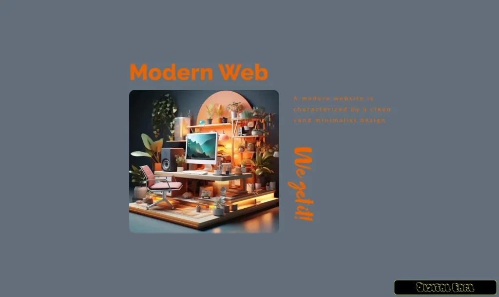
A modern website is a combination of cutting-edge visuals, user-centered design, and seamless functionality. In its most recent web development, it joins the latest trends and includes new technology, but it still holds on to the old simple and user-friendly principles such as usability and simplicity.
Key Features:
- Clean and Minimalist Layouts: The latest websites come in a very transparent look. They are void of visual disturbance and it is only the scattered elements that bring the clear feeling of space and thus the ease and the airiness of it. This graceful design minimizes the mental load and enables the audience to concentrate on the most required data or actions.
- Example: Apple’s site counts as a perfect example of minimalist designing. It is a use of white space and strong typography that highlights the products without distraction.
- Striking Visual Elements: High-resolution images, for example heroic and custom illustrations, are the leading factors in today’s websites. They are immediately eye-catching, and they often show the main message of the site, without prolonged explanations being necessary.
- Example: A travel website could place large images on a page that is easily luring to the wanderlust, adjacent to a simple CTA such as “Book Your Adventure.”
- Responsive Design for All Devices: By designing a mobile website first, it guarantees you that the website will work excellently across all types of devices, from mobile phones to laptops and desktop computers. The whole page’s layout, font sizes, and graphics will adjust proportionally and seamlessly to ensure the best user’s experience.
- Interactive Features: The user is engaged through a professional approach with some subtle interactions such as hover animations, parallax scrolling and curious cursors. These functions are a way to go deeper into the browsing procedure, providing much more value without making any guests feel uncomfortable.
How to Make Your Website More Modern?
Embrace Minimalist Design Principles
Minimalism in web design is not about stripping away elements but rather, focusing on the essentials. A minimal website helps to generate more conversions, when it removes the distractions, which ensures that visitors can easily get to the key messages and actions.
Practical Applications:
- Use Negative Space: Negative space helps to minimize the content and thus, to protract the visitor’s attention to its main parts. For example, a well-placed call to action (CTA) button along with enough space around it can help you to increase click-through rates.
- Flat Design: Complex graphics could be swapped with a flat version, which is simpler and less ridged, and more approachable thus, more understandable.
- Focus on Readability: Select readable fonts that are apt for your audience. They should not take a big part of the page with text; rather, styles and bullet points should be used to break up the content.
Leverage Bold Typography and Dynamic Color Schemes
Typography and color are a web design’s hidden power because it has the ability to speak without saying anything. Their main purpose is to communicate the identity of your brand. And they also do it in such a way to direct how the users will perceive or interact with your site.
Typography Tips:
- Bold Headlines: Letters of different thickness should be used in the creation of titles, in order to convey a sense of greatness and to draw the eye to the center of focus, in the most striking way with big letters.
- Font Pairing: Use the similar type of type separately for the headings and the rest of the text. The first thing to do, which is bold sans-serif for the headings, followed by lightweight sans to the body text. This kind of composition is very well organized.
Color Schemes:
- Stick to a color palette of 5-3 colors to guarantee the look of the website is consistent.
- Use the various color schemes for the different kinds of objects in the interface with a vibrancy level for the action parts.
- Think of inclusivity by using the contrast to make text and background more visible.
Example: The example below talks about Spotify that uses the color green against the black background to create a lively and inimitable brand style.
Prioritize High-Quality Visual Content
The first interaction with visual content is always via our eyes. The choice of an incorrect picture will surely spoil the overall site’s credibility, whereas a photo that’s inviting and professional can be a great asset.
Key Visuals:
- Hero Images: Full-width hero images at the top of the main page create an impression and also reveal the complete look of the site. Establish a strong bond with the audience using a visually stimulating hero image and a catchy headline.
- Custom Illustrations: Drawings are the unique way that adds authenticity besides that it can be related to the brand voice hence can be the memorable part of the site.
- Photography: Consider getting professional quality pictures or high-quality licensed photos that are in line with your content. Never showcase the mundane photos instead of the original ones that mostly imitate authenticity.
Animations:
- Parallax Scrolling: This brings about an effect of the background elements moving slower than the foreground ones, thus producing the effect of depth and engagement in the user’s mind.
- Micro-Animations: These small but beneficial animations have been known to improve user interaction by enhancing visual feedback and usability like changing the color of a button when hovered over.
Optimize for Mobile and Responsive Design
It is a necessity for every website to be mobile-friendly as mobile users account for more than half of all web traffic, website adaptation to mobile devices is no longer an option, it’s mandatory.
Steps to Achieve Mobile Optimization:
- Responsive Frameworks: Make full use of frameworks like Bootstrap if you want to operate a site that performs great on all devices even if it is a smaller one.
- Touch-Friendly Design: Make sure touchable items are the right size for users to drag their fingers over and touch without difficulty on touchscreens.
- Reduce Load Times: Optimize images, compress files, and minimize JavaScript to improve performance.
Example: Mobile-first indexing indicates that Google considers a website that takes less time to load and run smoothly even on smartphones as a priority.
Enhance Navigation and User Experience
Good navigation is the lifeblood of a website. If users have a hard time finding the information they need, they will leave without hesitation.
Best Practices:
- Hamburger Menus: These are getting to be very popular especially on mobile devices, which are their means of saving space and providing an easy way for customers to reach the site menu.
- Breadcrumbs: Leave users with an unmistakable way to trace their steps back to previous sections or back to the homepage.
- Search Bars: Search bars are a vital component for content-rich websites when users are looking for information in the quickest way possible.
Example: Amazon’s navigation is suitable for a considerable number of products to keep the shopping experience simple.
Why Do All Modern Websites Look the Same?
Actually, it is correct to say that most of the modern websites have the same principles and designs, but this is because these practises yield results. Factors such as minimalism, responsiveness, and coherent navigation design are associated with a good user experience and are closely linked in the minds of the visitors.
At the same time, it is important to note that brand differentiation, creative visual representation, and layout variation provides enough space to demonstrate originality. One way is to focus on adding unique personal touches, for instance, unusual typography or custom graphic illustrations, alongside sticking to the best practices to overseas.
Trending Modern Web Design Practices in 2025
The field of modern web design is constantly on the move. Here are some trends taking over in 2025:
- Dark Mode Options: A two-way switch between light and dark themes will be one of the features that will enable visitors to view the site in the desired way and thus will boost accessibility and personalization as well as saving energy.
- Voice User Interfaces (VUI): Increase in the use of voice-activated devices, voice search optimization, and products with such features on your site will result in the user becoming more used to them.
- Interactive 3D Elements: 3D product visuals apply a level of depth and/or on-the-edge user interaction in the case of product browsing. The idea is to engage the customer in the immersive/interactive journey and let him/her practically ‘sit at the wheel’ of the experience.
A dynamic combination of aesthetics, user feedback, and the intended application supports modern web site design. Include the current minimalist trend, high-quality graphics, and responsiveness as the features to create the site that engages, and the users keep coming back. By acknowledging the fundamentals of design, you can get your website up and running in no time. A well-thought-out project management process is mostly concerned with the requirements of the businesses and customers that the project is intending to address.
We tried to talk what does web design mean together with modern design I hope it is benefit you are. Now! Are you ready to make your website better? If you are a newbie or giving an old site a facelift, these principles are your foundation for going strong not only in 2025 but also beyond it.